Designing for Everyone: why you should care about Digital Accessibility

By
Alicia Bulbeck
,
Head of Business Operations
August 1, 2025
This is some text inside of a div block.
minute read

What do you know about Digital Accessibility? Following a powerful in-house knowledge-sharing session on the topic, I wanted to share what I learned and why at Branchspace we think it matters for everyone.

A Digital Experience you can’t use

Imagine shopping online for a duvet cover, but all you can hear is a robotic voice reading out jumbled code. You cannot see any images, text, or even navigate the page to find key information about the desired product.  

This was the eye-opening simulation shared by Marta Kończal from our UX/UI Design team during a Branchspace internal knowledge-sharing session. It was a powerful reminder that for millions of people, this is everyday digital reality.

Why Accessibility isn’t optional

Did you know that 27% of the EU population is estimated to have some form of disability1? That is over a quarter of the population whose digital experiences may be compromised every day.  

Accessibility is about more than compliance. It is about independence, dignity, and inclusion. Making sure accessibility standards are respected guarantees fullness of experience for everyone.

Accessibility is also a smart move for businesses as accessible products can reach more users and foster loyalty in the long term. How do non-sighted individuals navigate your booking flow? Can they find all the information they need to organise their trip and with as much ease as sighted people? If not, one can easily see why they would favour a different company or platform to book their next flight...  

According to the 2024–2025 State of Digital Accessibility Report, 70% of organisations in Europe and the U.S. say accessibility has a positive impact on customer acquisition and 68% agree it improves customer retention.

Finally, Digital Accessibility is now a legal requirement in the EU: the European Accessibility Act came into effect in June this year, giving organisations five years to meet the standards outlined in EN 301.549, which references WCAG 2.2 guidelines2.

What I learned so far

One key takeaway from our team’s knowledge-sharing presentation was that Digital Accessibility affects everyone and not just people with permanent disabilities. Think older adults, mobile users, people with slow internet connection, or those experiencing temporary impairments... The ‘impaired minority’ is a minority anyone might join at some point in their life.  

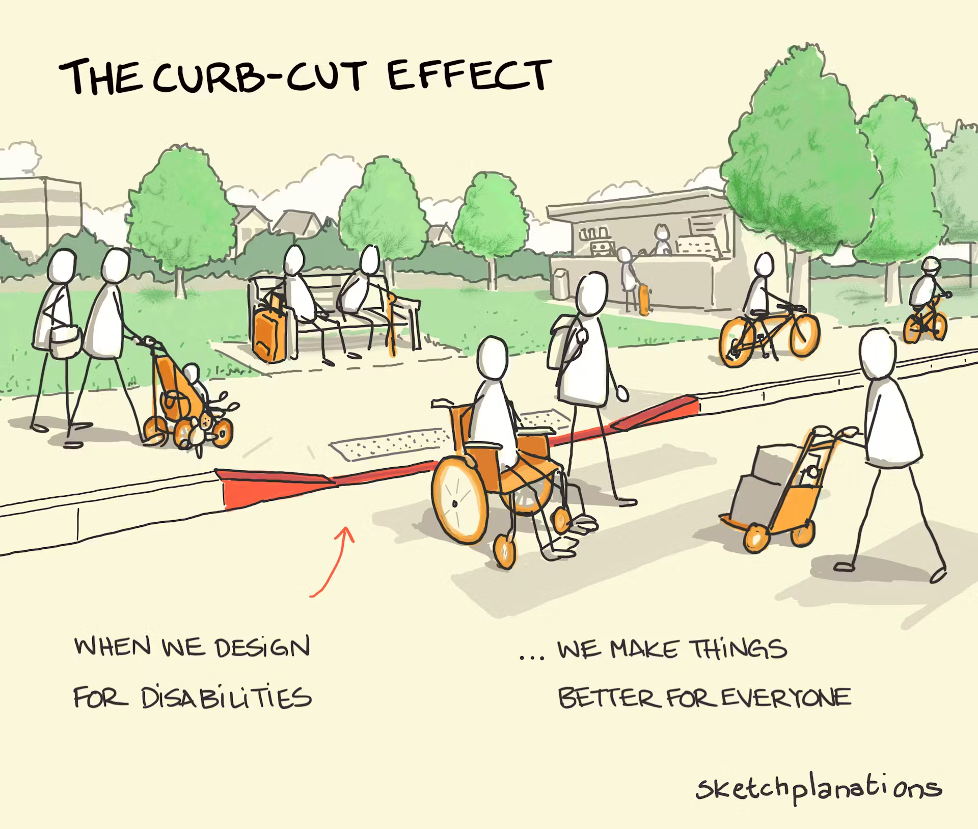
We also discussed the “curb-cut effect” and how designing with accessibility in mind can help improve usability for all.

Sketch plantations

Finally, Marta demonstrated how screen readers and low-vision simulations can be great tools to help reveal hidden barriers in everyday interfaces. They are useful to raise awareness and understand where accessibility might be improved on a given application or website.  

Where Branchspace stands

As a company, we are taking Accessibility seriously and are mindful of our responsibility in creating products that are suitable for all users.  

In line with our ESG strategy and vision, we  aspire to embed accessibility into our Triplake product development lifecycle and our fantastic UX team is leading the way, building internal resources and checklists based on WCAG standards.  

On the Consulting side, we are already helping out our customers by conducting accessibility audits.  

Digital Accessibility is everyone’s responsibility—from designers and developers to testers and managers and as our CTO, David Turton, put it during the session:

“ Even if we were perfect today, we need to keep building accessibility into our day-to-day work.”  

Let’s Talk

At Branchspace, we believe inclusive design is better design.
If you are curious about how accessible your digital products are or want to explore how to improve them, get in touch with our team today! We would love to help you assess, plan, and build digital experiences that work for everyone.

References:  

  1. https://ec.europa.eu/eurostat/statistics-explained/index.php?title=Population_with_disability
  1. https://www.w3.org/TR/WCAG22/  

The average airline web portals is not broken. It loads, it sells tickets. It technically does what it's supposed to do.

And yet, the experience feels tiring.

You notice it when you try to do something simple. Change a seat. Find your gate. Understand what happens if a flight is delayed. Suddenly you are scanning long pages, decoding airline terminology, clicking back and forth just to stay oriented.

The problem is not with the features, It is effort effort required in getting from A to B.

Airline portals still expect travellers to think like systems. To understand menus, categories, fare families, ancillaries, rules. But travellers arrive with something much simpler. Intent.

They want to get something done and get on with their journey.

This article posits that airline web portals should stop behaving like navigation systems and start acting as intent-aware decision environments. When UX is designed to reduce effort, adapt to context, and quietly support travellers at each stage of the journey, portals become calmer to use, easier to trust, and far more effective for airlines.

The basics still matter more than airlines think

Before talking about AI or personalisation, it is worth being honest about the fundamentals.

You can see that accessibility standards aren’t yet being applied and portals aren’t optimised for mobile, which results in performance drops. Navigation feels heavier than it needs to be. Search often works, but only if you already know what to ask and how the airline expects you to ask it.

These are not exciting topics, but they shape everything that comes after. If a portal is slow, confusing, or inaccessible, no amount of intelligence layered on top will fix the experience.

At Branchspace, we see this repeatedly. Airlines want to move faster, personalise more, experiment. But the UX foundation is not always ready to support that ambition.

Where portals lose traveller trust

The biggest UX issues are rarely dramatic, they are subtle and cumulative:

  • A vague error message that offers no next step
  • A long paragraph that hides the one thing the traveller needs to know
  • Three different words for the same concept depending on where you are in the journey
  • A mobile page that technically works but feels endless

In isolation these are small instances, but they compound to create friction for a user. And friction erodes confidence.

Travellers begin to hesitate, scan more carefully, and spend extra effort just trying to stay oriented. They stop trusting that the portal will help them when things go wrong. Good UX goes beyond delight, it is about reassurance.

Decision-making is the real job of UX

Every airline portal is a decision-making environment:

  1. Choose a flight
  1. Choose a fare
  1. Choose a seat
  1. Decide whether to rebook or wait

The role of UX is not to present all options equally. It is to reduce the mental work required to choose well.

That is where simple principles matter more than flashy ideas: clear visual hierarchy, familiar patterns, plain language, and progressive disclosure.

When these are done properly, travellers stop analysing the interface and start moving confidently through it.

This is also where intent-led thinking becomes powerful. When portals are designed around tasks rather than pages, complexity begins to fall away naturally.

What changes when you design for intent

airline web portal checklist items

When you stop designing for navigation and start designing for intent, the portal behaves differently:

  • Shift the focus to intent and the portal begins to respond in new ways
  • Search leads the experience rather than sitting in the background
  • Logged-in travellers with an upcoming trip see what they can do next, instead of being asked to explore

This is the direction we have been taking with platforms like Triplake by allowing the portal to respond to context, trip stage, loyalty status and behaviour.

Where AI actually helps and where it should stay quiet

AI has a role in airline UX, but it works best when it stays in the background rather than taking centre stage. The strongest AI-driven experiences are often the ones you barely notice, because the interface feels simpler and the path forward feels clearer.

That might mean routing a traveller straight to the right outcome based on a natural language query, or surfacing the most relevant rebooking option when a disruption occurs. In other moments, it is about removing repetition altogether, using known preferences to spare travellers from making the same choices again and again.

At its best, AI offers clarity, supports decisions without trying to make them on the traveller’s behalf. People still want to feel in control of their journey, they just do not want to work so hard to get there.

The portal is becoming a living interface

The most interesting shift we are seeing has very little to do with technology and everything to do with behaviour. Airline portals are gradually moving away from being static websites and towards adaptive interfaces that respond to where a traveller is in their journey.

Before the trip, the portal helps you prepare. On the day of travel, it shifts into a supportive role, surfacing the information that matters most in the moment. Afterwards, it follows up, closing the loop rather than simply ending the experience.

Making this work demands modular design systems, flexible platforms, and teams that think beyond individual pages and flows. It is not an easy change, but it is both achievable and increasingly necessary.