After years of travel techs extolling the virtues of user-centricity, airline teams have started to place new emphasis on their user experience and building in-house UX teams. In more ways than one, the pandemic has accelerated this tone shift, and travel providers opting for a digital rethink often have their plate full.
However, no step-change would be complete without refreshing a critical digital customer touchpoint: the airline portal. We’ve outlined our recommendations to help you get it right.
#1 Keep your customer in mind.
Your customers come to your site for a variety of different reasons. They may have seen your out-of-home promotions, or they may have spent some time pricing out flights on Google and Skyscanner and finally settled on booking your flight. Alternatively, they may have flown with you a couple of times before and naturally gravitate to your site as their first port of call. There’s also the possibility that they may have seen your promotional content on outdoor ads or social media. Or they may access your site for entirely different reason than buying a flight, such as managing an existing booking, or checking the latest travel restrictions.
No matter how they found you, the airline site needs to offer simple and intuitive navigation. The sitemap should follow the flow of the customer journey, anticipate the needs of the user and cater to them at every stage. For example, customers who are ready to enter the shopping phase need quick and easy entry points into the booking flow––not only from the homepage widget, but across multiple touch points in the portal. Alternatively, pre-flight customers may come to the site to look for flight status and disruption information, travel requirements, or booking management entry points––a clear, organised information architecture will help users find this information efficiently. Both scenarios require assessing how much information the customer needs, and where it makes sense for that information to sit within the customer journey.
#2 Give your customers a reason to convert.
While a customer may be searching for flights using your website, it does not necessarily indicate that they have not finished their initial browsing and pricing stage. That’s why it is incredibly important to give your website visitors a reason to convert by including inspirational content that showcases your network.
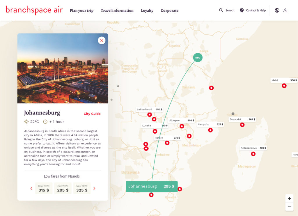
Example of a route map with inspirational content
For example, an airline servicing mainly inbound leisure travel would be best suited to content depicting what travellers come to their destination for: stretches of sparkling beaches, crystal-clear coral reefs, breath-taking mountain views, etc. On the other hand, airlines with larger networks can demonstrate the breadth of their destination offering with route maps and inspirational search.
#3 Design by persona.
When you approach a website redesign with a user-centric mindset, the importance of progressing from a static, user-agnostic portal to persona-driven content can not be stressed enough. At the very least, adding the recent search history or personalised recommendations for logged-in users can help direct customer search.
Taking a step further, personas representative of your customer base are instrumental in tailoring inspirational content and ensuring your UX caters to your customer needs. Critically, these personas should be sourced from your customer data by using clustering analysis and other scientific methods, rather than intuition.
If your airline has already developed personas, it might be more useful to update or remodel based on fresh data as passenger sentiment continues to shift with the pandemic. For inspiration, you might consider IATA’s COVID passenger survey or Skyscanner’s traveller sentiment studies. While good starting points, these should provide perspective on your own customer analysis and user studies––you risk sliding into confirmation bias otherwise.
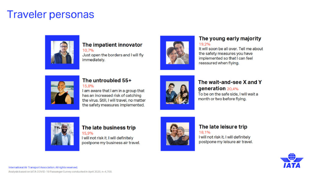
IATA’s traveler personas developed from their April 2020 Passenger Survey
#4 Adapt for mobile.
Last but not least, any update to your portal site should be reflected across your airline mobile experience. Whether your mobile experience is native or browser-based, you will need to define content that works more effectively in the mobile context with an adaptive content approach. For example, a user may need to contact your customer service desk during their transit to the airport, and thus accesses your mobile site. It makes the most sense in this scenario for a direct phone number or web-based chat (rather than email link) to be surfaced.
For example, some best practice UX guidelines for PWAs include providing a simple navigation structure, minimising load times with simple fonts, enabling offline modes, and ensuring that the overall experience feels like a native app with clear calls-to-action and touch feedback.
What to watch out for
Any portal redesign should be exactly that––a redesign. This means you’ll need to strike the right balance between commercial objectives and design, as well as between new and old. In the past, we’ve seen good intentions miss the mark slightly in a few common areas:
- Overwhelmed information architecture: It may go without saying, but information hierarchies are not infinitely scalable. Competing business and design objectives should be aligned and reconciled with user needs before making any updates, as updating content can very quickly turn into page gratia pages.
- Flight offer clutter: While slightly less of a trend now, surfacing deals or flight offers can be useful for pushing customers to convert but only when done so intelligently. This includes both personalised and contextualising offers, as well as remaining selective about which offers are displayed on the front page: drowning your consumer out in a sea of choice does little to guarantee they’ll convert at the end of the session.
- Disruption overload: Of course, airlines during times of crisis need to surface key information about adjustments to routes and boarding procedures. However, this information should be carefully displayed in a context and at a touchpoint which suits the user. By pushing all information about your route availability upfront, you risk confusing customers and driving them to your competitors where they can guarantee their flight will still take off.
Takeaway
Even in the golden age of NDC and direct booking via Google Flights or Skyscanner, travellers will still book their flights directly on an airline website. Redesigning the airline portal can represent a significant investment in updating your brand, but it shouldn’t jeopardise your customer base.
When executed well and with the customer in mind, your portal redesign can be a priceless opportunity to strengthen your brand perception and build trust. If you have any questions, drop us a line below and we’ll be happy to help.
