Designing with clarity, trust and purpose: lessons from Future Product Days 2025

By
,
October 28, 2025
This is some text inside of a div block.
minute read

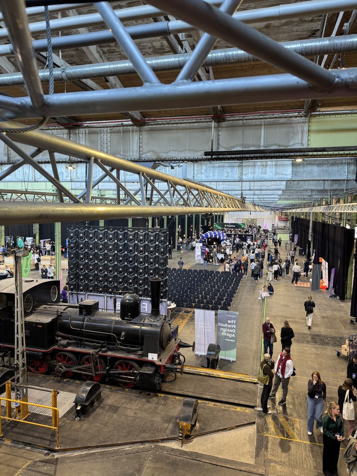
Copenhagen in late September was at its most cinematic: clear skies, red-brick warehouses draped in ivy, and a steady flow of designers, engineers and product leaders rolling up on bicycles. Inside Lokomotivværkstedet, an old train hall now filled with light and conversation, hundreds of people gathered for Future Product Days 2025: three days dedicated to the craft of building products that matter.

From Branchspace, Dorota Ziajka and Maciek Zarychta joined the event, part conference, part workshop festival, to immerse themselves in talks spanning psychology in design, AI-assisted product definition, and trust-based leadership. Their reflections capture why spaces like this are essential not only for inspiration but for grounding how we build in travel tech.

When clarity becomes culture

In one of the opening workshops, Applying the ESI Framework, teams explored how to bridge user goals, system logic and design intent. The message was simple yet powerful: start with clarity. Define what success looks like and why we’re doing it, before anything else.

That theme echoed throughout the conference. Whether in Petter Hornfeldt’s aviation-inspired session on decision-making or in conversations about AI tools and team dynamics, clarity kept resurfacing as the foundation of trust. “If it works in the sky, it works in the office,” Hornfeldt said, drawing a smile from the crowd.

Dorota left with a note that feels universal for product teams: act as enablers of understanding. Connect business goals with user needs. Make progress visible. Create spaces where teams can talk about mistakes without fear because that’s where real learning happens.

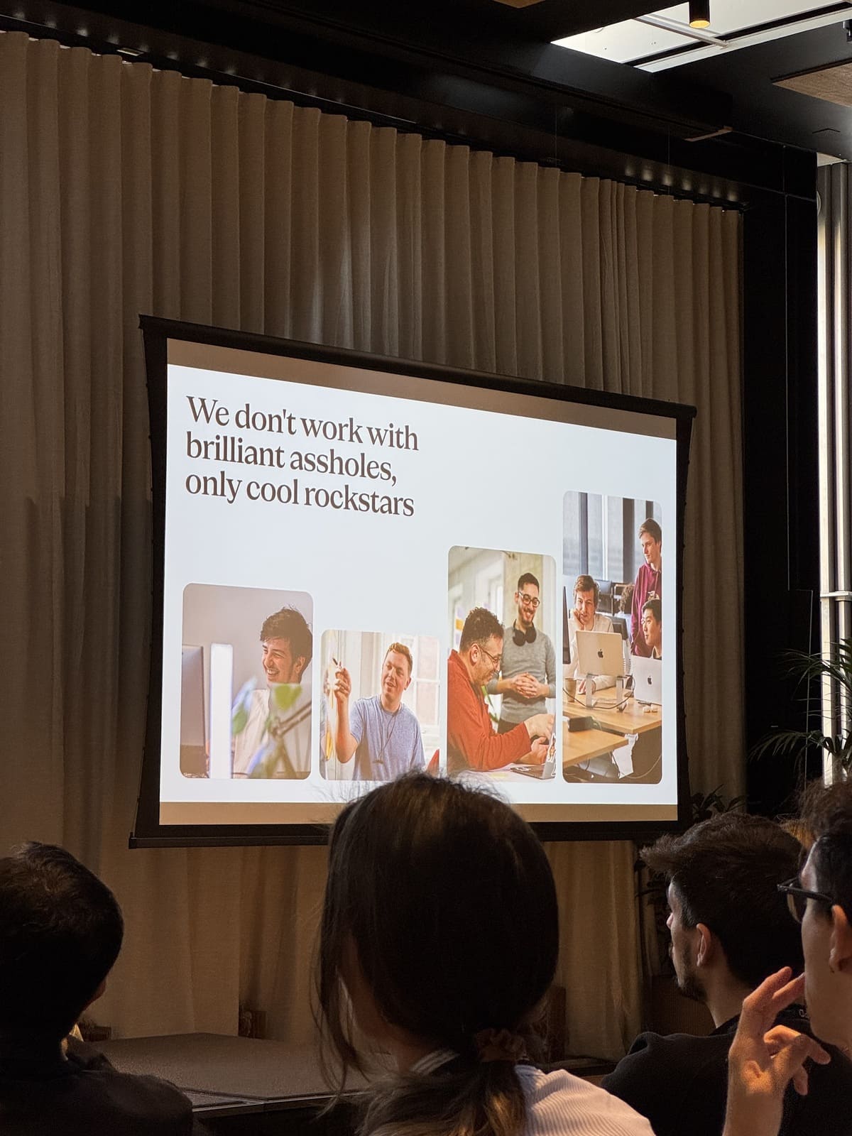
Building with empathy, not ego

Across sessions, the focus repeatedly turned to empathy and psychological safety. In one memorable slide, a speaker stated bluntly: “We don’t work with brilliant assholes, only cool rockstars.”  Teams that trust one another move faster, share ownership, and ultimately build better products.

future product days 2025 presentation

Maciek’s standout session, The Future of the Product Creator, led by Tobias Ahlin (Hacker, GitHub / Spotify alumni), explored how great products come from teams that mix bold experimentation with empathy. His key line: “Design not just for users, but with them.”

That thinking resonated with the Branchspace mindset. Our best work happens when product, design and engineering move as one. When experimentation is not a luxury but a habit.

From unused features to human-centred impact

One talk analysed why great features often go unused, highlighting that even well-built functions can fail without discoverability or context. A favourite example was Amazon’s AI assistant “Rufus”: praised by those who found it, missed by the majority because its icon sat hidden in a top-left corner.

The takeaway was clear: a product’s success is measured not by what it can do, but by how easily people can find and value it.

This principle surfaced again in a case study from TENA, whose team reimagined its mission from selling a necessary product to restoring dignity. By designing a discreet, sensor-based wearable that integrates with Apple Watch, they reframed the problem itself. The message: the best innovation begins with empathy, not features.

“Be the best mover, not the first”

Friday’s all-day session What’s New in Digital Products challenged the obsession with speed. It argued that product excellence doesn’t come from being first to market but from being the best mover: deliberate, high-quality, and purposeful.

That idea mirrors our approach at Branchspace. In airline retailing, rushing transformation can break trust, while measured, quality-driven execution builds loyalty. For us, best mover thinking means maintaining high standards, giving developers space to solve creatively, and anchoring every release to tangible value for travellers and airlines alike.

How this shapes our work at Branchspace

Returning from Copenhagen, our team brought back more than notes. We brought a reaffirmed belief that:

  • Clarity precedes speed — define vision before delivery.
  • Empathy shapes impact — solve for people, not features.
  • Trust fuels creativity — safety in teams produces better design.
  • Quality outlasts novelty — aim to be best mover, not just fastest.

These principles directly inform how we continue to evolve our Triplake platform and Transform consulting work: ensuring product strategy, UX design and engineering stay tightly linked, and that experimentation remains disciplined but fearless.

Final thought

As one speaker put it, “When you shape a product, you shape society.” That line stayed with us. At Branchspace, shaping the future of airline retailing means crafting experiences that reflect clarity, empathy and purpose.

And that’s exactly what events like Future Product Days remind us to do.

The average airline web portals is not broken. It loads, it sells tickets. It technically does what it's supposed to do.

And yet, the experience feels tiring.

You notice it when you try to do something simple. Change a seat. Find your gate. Understand what happens if a flight is delayed. Suddenly you are scanning long pages, decoding airline terminology, clicking back and forth just to stay oriented.

The problem is not with the features, It is effort effort required in getting from A to B.

Airline portals still expect travellers to think like systems. To understand menus, categories, fare families, ancillaries, rules. But travellers arrive with something much simpler. Intent.

They want to get something done and get on with their journey.

This article posits that airline web portals should stop behaving like navigation systems and start acting as intent-aware decision environments. When UX is designed to reduce effort, adapt to context, and quietly support travellers at each stage of the journey, portals become calmer to use, easier to trust, and far more effective for airlines.

The basics still matter more than airlines think

Before talking about AI or personalisation, it is worth being honest about the fundamentals.

You can see that accessibility standards aren’t yet being applied and portals aren’t optimised for mobile, which results in performance drops. Navigation feels heavier than it needs to be. Search often works, but only if you already know what to ask and how the airline expects you to ask it.

These are not exciting topics, but they shape everything that comes after. If a portal is slow, confusing, or inaccessible, no amount of intelligence layered on top will fix the experience.

At Branchspace, we see this repeatedly. Airlines want to move faster, personalise more, experiment. But the UX foundation is not always ready to support that ambition.

Where portals lose traveller trust

The biggest UX issues are rarely dramatic, they are subtle and cumulative:

  • A vague error message that offers no next step
  • A long paragraph that hides the one thing the traveller needs to know
  • Three different words for the same concept depending on where you are in the journey
  • A mobile page that technically works but feels endless

In isolation these are small instances, but they compound to create friction for a user. And friction erodes confidence.

Travellers begin to hesitate, scan more carefully, and spend extra effort just trying to stay oriented. They stop trusting that the portal will help them when things go wrong. Good UX goes beyond delight, it is about reassurance.

Decision-making is the real job of UX

Every airline portal is a decision-making environment:

  1. Choose a flight
  1. Choose a fare
  1. Choose a seat
  1. Decide whether to rebook or wait

The role of UX is not to present all options equally. It is to reduce the mental work required to choose well.

That is where simple principles matter more than flashy ideas: clear visual hierarchy, familiar patterns, plain language, and progressive disclosure.

When these are done properly, travellers stop analysing the interface and start moving confidently through it.

This is also where intent-led thinking becomes powerful. When portals are designed around tasks rather than pages, complexity begins to fall away naturally.

What changes when you design for intent

airline web portal checklist items

When you stop designing for navigation and start designing for intent, the portal behaves differently:

  • Shift the focus to intent and the portal begins to respond in new ways
  • Search leads the experience rather than sitting in the background
  • Logged-in travellers with an upcoming trip see what they can do next, instead of being asked to explore

This is the direction we have been taking with platforms like Triplake by allowing the portal to respond to context, trip stage, loyalty status and behaviour.

Where AI actually helps and where it should stay quiet

AI has a role in airline UX, but it works best when it stays in the background rather than taking centre stage. The strongest AI-driven experiences are often the ones you barely notice, because the interface feels simpler and the path forward feels clearer.

That might mean routing a traveller straight to the right outcome based on a natural language query, or surfacing the most relevant rebooking option when a disruption occurs. In other moments, it is about removing repetition altogether, using known preferences to spare travellers from making the same choices again and again.

At its best, AI offers clarity, supports decisions without trying to make them on the traveller’s behalf. People still want to feel in control of their journey, they just do not want to work so hard to get there.

The portal is becoming a living interface

The most interesting shift we are seeing has very little to do with technology and everything to do with behaviour. Airline portals are gradually moving away from being static websites and towards adaptive interfaces that respond to where a traveller is in their journey.

Before the trip, the portal helps you prepare. On the day of travel, it shifts into a supportive role, surfacing the information that matters most in the moment. Afterwards, it follows up, closing the loop rather than simply ending the experience.

Making this work demands modular design systems, flexible platforms, and teams that think beyond individual pages and flows. It is not an easy change, but it is both achievable and increasingly necessary.