The mobile moment: why apps are now the passenger’s remote control
Airline mobile apps have shifted from “nice to have” to the passenger’s remote control for the journey. Travellers today expect to plan, book, check in, manage disruptions and access loyalty benefits all in one place. In fact, IATA research shows that more than half of passengers now prefer digital channels for booking and servicing, with mobile apps playing an increasingly central role.
The demand is not only pre-flight. At the airport, mobile is how people check boarding times, navigate the terminal and receive disruption updates. SITA’s Passenger IT Insights 2024 highlights that over 34% of passengers want to see an improvement in real-time notifications on flight status.
The message is clear…without a strong app, airlines risk losing relevance at every stage of the journey.
The gold standard for airline apps today
Passengers judge apps against the best digital experiences they use daily, not just other airlines. The bar has risen:
- Table stakes: smooth booking, seamless check-in, reliable servicing, digital boarding passes and visible loyalty balances.
- Emerging expectations: biometric integration, digital IDs, location-aware offers and one-tap payments.
Reliability is a hidden but powerful driver of trust. Industry app performance benchmarks have set high standards.
“anything lower than a 99.95% crash-free session rate should revisit their stability targets or risk being outperformed by the competition.”
For airlines, this should be the baseline for engagement.
Where value is created: three commercial levers
For airline leaders, mobile apps are not just a customer service tool. They can be direct levers of revenue and loyalty when executed well.
- Conversion and attachment
Ancillaries such as seats, bags, meals and upgrades contribute a growing share of airline revenue, projected to reach $728 billion by 2030 (up from $169 billion in 2022). Presenting these clearly and contextually in the app boosts uptake far beyond static email campaigns. Mobile apps by their nature, and interface, present a great opportunity for dynamic pricing.
- Engagement and habit
Push notifications, when used intelligently, can lift conversion rates and keep the airline front of mind. In a Dataroid case study, Pegasus Airlines saw users who received push notifications purchase 72% more tickets on campaign days compared to users who did not.
- Loyalty and recognition
App-native loyalty integration reduces friction, builds trust and encourages direct channel booking. A passenger who sees exactly how many points they will earn or burn at checkout might consider the airline over an OTA.
Related: From points to personalisation: rethinking airline loyalty
Why many airline apps underperform
Although airline apps have potential, many do not keep pace. Some common reasons are:
- Fragmented back-ends that prevent features from working smoothly.
- Feature bloat that adds complexity instead of clarity.
- Procurement vs innovation conflict: commercial teams want proven ROI, while digital leaders push for innovation. Big-bang projects often stall under cost scrutiny.
- Regional realities: regional airlines face additional challenges such as variable bandwidth, local payment needs and multilingual support.
The outcome is predictable: passengers abandon apps that are slow, clunky or unclear. As a result airlines miss out on revenue.
A pragmatic path that aligns digital, commercial and procurement
So how do you break this cycle? The answer lies in starting small, proving value and scaling with confidence.
- The MVP-to-scale playbook
Begin with a lean, reliable foundation covering booking, check-in, and servicing visibility. Then, expand to personalisation, ancillaries marketplaces and richer loyalty once KPIs prove the case.
- Cost-benefit framing that resonates with procurement
A minimum viable product reduces upfront risk, accelerates time to value, and provides a roadmap tied to measurable KPIs. Procurement teams see reduced call-centre load and improved direct channel shift, while digital leaders get the innovation runway they need.
The industry backdrop supports this strategy: Phocuswright data shows digital and mobile bookings continuing to grow year-on-year, making early wins both visible and defensible.
How Triplake On the Go supports this journey
At Branchspace, we built Triplake On the Go with exactly these tensions in mind. It is the fastest path to a modern, scalable mobile app.
- Modern, consistent experience from day one
Booking, check-in and servicing flows optimised for speed and clarity, underpinned by reliability targets that meet modern app stability benchmarks.
- Loyalty that shows up in real journey moments
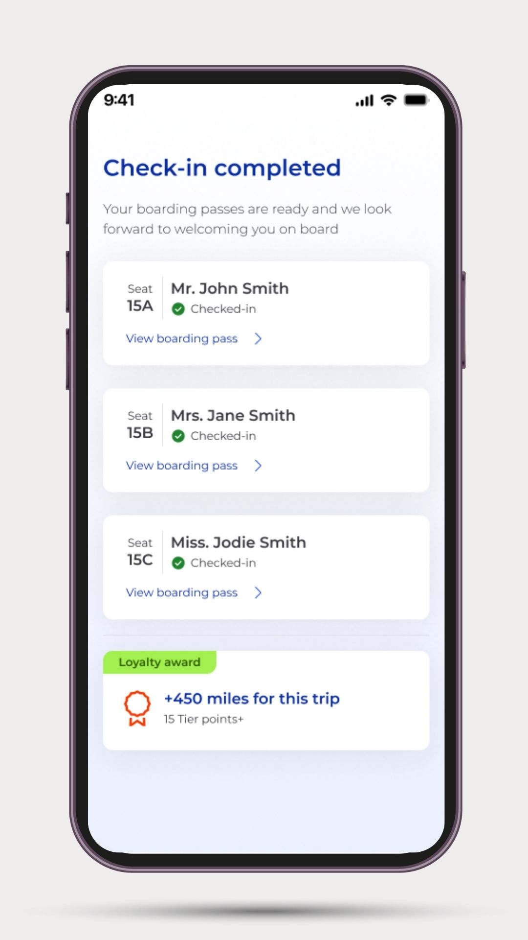
Logged-in recognition, visible points and personalised earn-burn opportunities at checkout.
- Ancillaries marketplace on mobile
Modular catalogue of airline and third-party ancillaries, from seats and bags to hotels and experiences, driving new revenue streams.
- Personalisation and notifications that move the needle
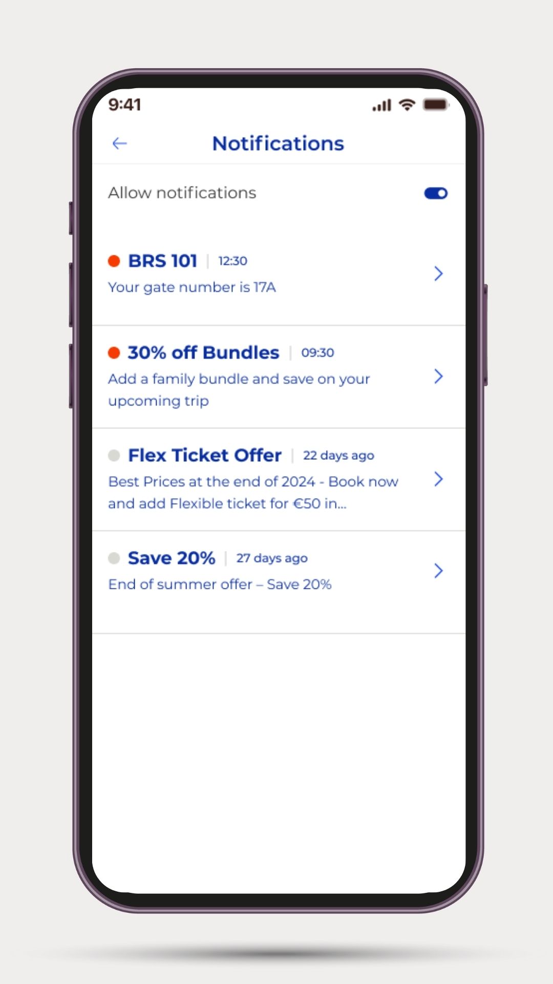
Behaviour-aware prompts for upgrades, disruption handling, or destination inspiration with proven impact on conversion.
- Built to scale with your roadmap
Start with an MVP, add modules as you go. Triplake On the Go works with legacy systems today, while preparing you for tomorrow’s offer and order standards.
With Triplake On the Go, the path is flexible and pragmatic:
- For airlines starting from a low digital base, it means moving quickly from basic functionality to a dependable app
- For airlines already running modern retailing platforms, it extends those capabilities into mobile, creating a unified and consistent customer experience across channels.
- For airlines weighing first-time investment in mobile, it offers a de-risked release that can start small and gradually expand into loyalty integration and marketplace features.
Measuring success and communicating it internally
Executives want proof. Triplake On the Go is designed around measurable success metrics, phased to match airline priorities:
- Phase 1 MVP: crash-free sessions, check-in completion, app store rating, notification opt-ins.
- Phase 2 growth: ancillary attachment rates, upgrade take-rates, loyalty log-ins, repeat usage, NPS.
The advantages show up across the organisation. Cost savings are realised through reduced reliance on call centres and stronger direct channel performance. At the same time, new ancillary revenue streams emerge as customers engage more deeply through mobile. And because the app is designed to scale without requiring a complete rebuild, there is room to innovate and add capabilities over time without starting from scratch.
Conclusion
Mobile has become the control surface for the journey. Passengers expect it, competitors are investing in it, and revenue depends on it.
With Triplake On the Go, airlines can move fast without overcommitting, prove value early, and scale into the future of airline retailing.
